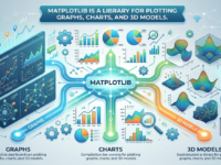
Matplotlib is a library for plotting graphs, charts, and 3D models.
We’ll show you how to use shortcuts to plot graphs, assign titles, visualize functions, and apply other formatting techniques using the Matplotlib library.
The Matplotlib library and its purpose
Matplotlib is an open-source library for data visualization in Python. It can be used to create scatter and pie charts, line graphs, histograms, error bars, and 3D plots. Visualization results can be exported in PDF, SVG, JPG, PNG, BMP, and GIF formats.
Working with Matplotlib doesn’t require complex protocols. The library helps visualize large amounts of data with short commands. Therefore, Matplotlib is used as a replacement for MATLAB, a more complex visualization tool.
Types of graphs and charts in Matplotlib
A full list of graphs and charts is available on the Matplotlib website. We’ll look at some of them.
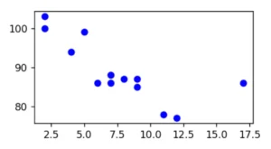
● A scatterplot displays the relationship between two variables. Each data point is represented by a point on the graph, where the coordinates of the point correspond to the values of those variables. The matplotlib library provides the scatter() method, which helps illustrate the interdependence between variables and how changes in one variable can affect the other.
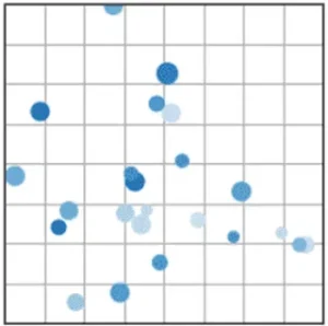
This is what a scatterplot might look like in Matplotlib. This type of chart is suitable for visualizing, for example, the difference between a client’s age and their income or the ratio of job openings to applicants. Source
● A column chart is a visualization of categorical data. It displays values as rectangles, the height of which corresponds to the quantity or value for each category. Column charts are suitable for visualizing trends, ratings, and relationships between multiple values, such as revenue in two stores.
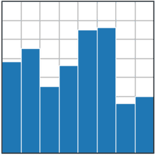
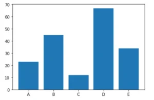
Example of a bar chart in Matplotlib. Source
● A pie chart is a visualization of proportions of categorical data. It shows the share of each category in the total. A pie chart is suitable for visualizing, for example, market share, sales, or respondents.
The matplotlib library provides the pie() method, which can be used to create a pie chart with variables and a nested pie chart. This can be done by overlaying multiple pie charts with different radii. The outer pie chart will contain the main categories, and the inner pie chart will contain the subcategories. This structure is typically used to display coefficients within coefficients.
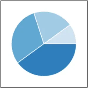
Example of a pie chart in Matplotlib. Source
● A line graph is a visual representation of data in which data points are connected by lines. It is commonly used to show changes in the value of a variable in relation to another variable, such as time. Line graphs are suitable for analyzing trends or changes in stock prices, for example.
An example of a line graph in Matplotlib. Source
● 3D graphics — visualization of three-dimensional objects and scenes using computer graphics. Such graphics are suitable, for example, for visualizing realistic characters and environments, objects.
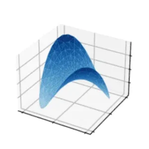
An example of a 3D plot in Matplotlib. Source
Basics and Getting Started with Matplotlib
Matplotlib must be installed along with the Pyplot package, a Python module of the Matplotlib library. It helps embed various components into graphs without using long lines of code. For example, you can create labels, lines, dots, and so on. Pyplot appears in the code as matplotlib.pyplot.
Some programs have Matplotlib and Pyplot installed by default. For example, Google Colab and Jupyter Notebook already include the library and module. Other programs have shortcuts for importing Matplotlib and Pyplot:
-
pip3 install matplotlib – import Matplotlib.
-
import matplotlib.pyplot as plt – Pyplot import.
Setting up charts
Let’s look at the settings for scatter charts, bar and pie charts, line and 3D graphs.
● Scatterplot. For example, we will create a scatterplot with X and Y coordinates, and the points will be displayed in blue.


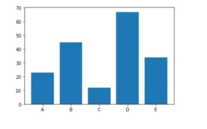
● Column chart. For example, let’s create a chart of the number of items sold in five store branches: A (23 units), B (45 units), C (12 units), D (67 units), E (34 units). The code will be as follows:


● Pie chart. Let’s create a chart with car brands: [AUDI, BMW, FORD, TESLA, JAGUAR, MERCEDES]. Each car brand has its own share on the chart: [23, 17, 35, 29, 12, 41]. The code will be like this:
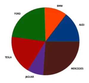
This is what a pie chart of car brands looks like. Source
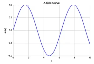
● Line graph. For example, let’s visualize the function y = f(x), where x = 0, 10, 1000. The code will be as follows:
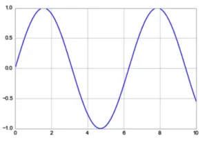
This is what a linear graph of a function looks like. Source
● 3D graph. For this example, we’ll create a spring in 3D format. To do this, we’ll need to import the mplot3d toolkit. Then, set up the axes, grid, and labels. The code will be as follows:
import numpy as np
from mpl_toolkits import mplot3d
import matplotlib.pyplot as plt
plt.style.use(‘seaborn-poster’)
fig = plt.figure(figsize = (10,10))
ax = plt.axes(projection=’3d’)
plt.show()
fig = plt.figure(figsize = (8,8))
ax = plt.axes(projection=’3d’)
ax.grid()
t = np.arange(0, 10*np.pi, np.pi/50)
x = np.sin(t)
y = np.cos(t)
ax.plot3D(x, y, t)
ax.set_title(‘3D Parametric Plot’)
ax.set_xlabel(‘x’, labelpad=20)
ax.set_ylabel(‘y’, labelpad=20)
ax.set_zlabel(‘t’, labelpad=20)
plt.show()
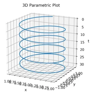
An example of a 3D figure using the Matplotlib library. Source
Examples of use
Let’s look at examples of how to use the library’s capabilities: assigning titles, creating axes and labels, changing parts of elements or the distance between elements, and creating three-dimensional models.
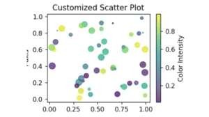
● Scatter plot with title and axis labels. We’ll create the plot using Matplotlib and NumPy, which generates random data for x and y coordinates, colors, and sizes. We’ll configure the properties—color, size, transparency, and colormap. The plot will include a title, axis labels, and a color intensity scale.
# Import NumPy.
# Generating random data.
# Axis title and labels.
# Display the color intensity scale.
# Result.
plt.show()


● A bar chart with formatted spacing between bars. To do this, add the width to the plt.bar function. Let’s say the width between bars is 0.5. The code would be:

● Line chart with titles and axis labels. To quickly add titles and axes, use the following code:
Example of a line chart with a title. Source
● A 3D scatterplot. For example, let’s set the variables to 50 data points for x, y, and z; color: red. The code would be:
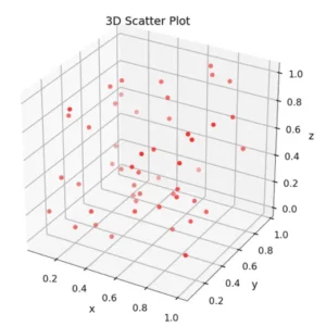
An example of constructing a 3D scatterplot. Source
● Scatterplot with multiple data sets. For example, let’s take two different data sets, each with its own set of x and y coordinates:
1. x1 = [89, 43, 36, 36, 95, 10, 66, 34, 38, 20]; y1 = [21, 46, 3, 35, 67, 95, 53, 72, 58, 10].
2. x2 = [26, 29, 48, 64, 6, 5, 36, 66, 72, 40]; y2 = [26, 34, 90, 33, 38,20, 56, 2, 47, 15].
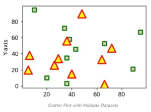
Scatterplot with multiple data sets. Source