Components in Figma: How They Work and What They’re For
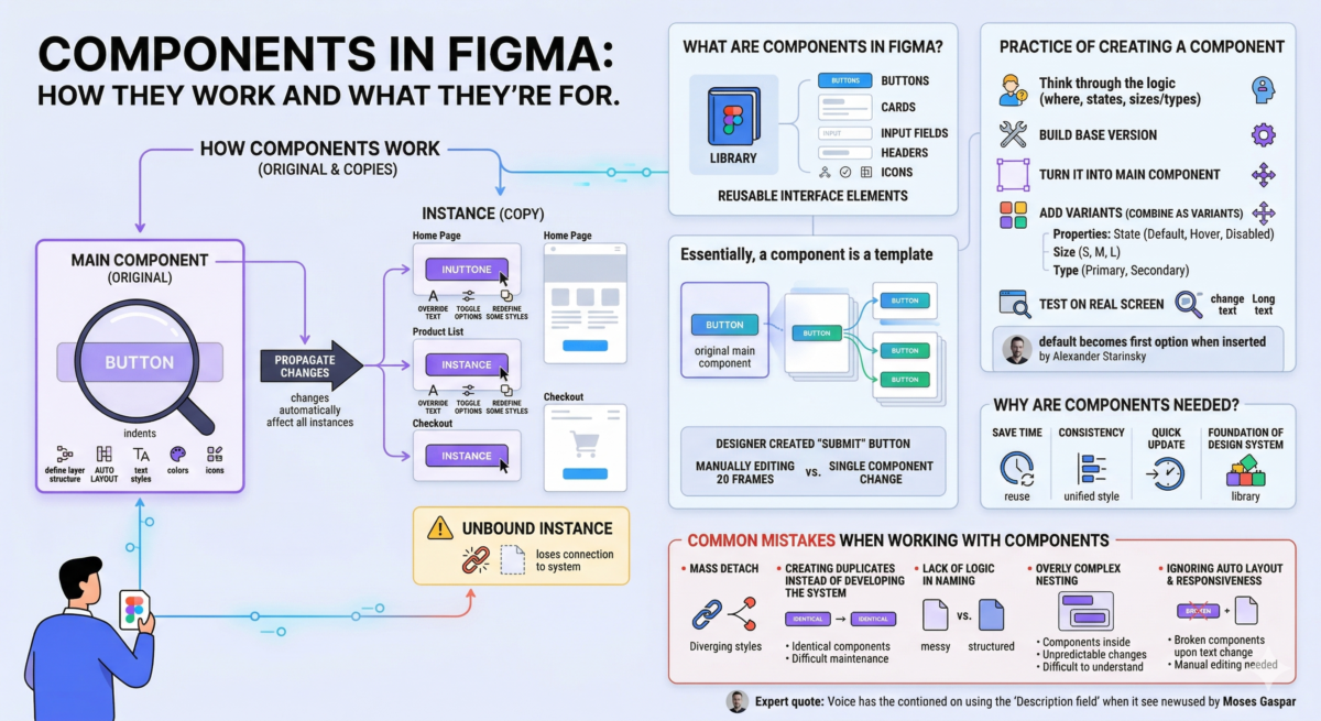
Table of Contents
What are the components in Figma?
Components in Figma are reusable interface elements. Buttons, cards, input fields, headers, icons—anything that appears more than once in a layout can be turned into a component.
Essentially, a component is a template. It has a main component, the original version, and instances—copies of it that are inserted into the layout. If you change the main component, the changes are automatically applied to all instances.
For example, a designer created a “Submit” button. This button appears on 20 screens. If these were just 20 individual frames, each would have to be edited manually. If it were a component, a single change would be enough, and everything would update.
Why are components needed?
Figma components primarily help scale designs. Here are the tasks they solve:
- Save time. You don’t have to recreate a button or product card every time. It’s created once and then simply reused.
- Consistency. If buttons in a product have slightly different radii or colors, the interface begins to “flow.” Components create a unified style.
- Quick update. Let’s imagine a brand has updated the accent color. If the button color is manually applied to 100 mockups, that’s hours of work. If the button is a component, the change takes a minute.
- The foundation of the design system. Components form the basis of libraries of interface elements used by all designers on the team.
How do components work?
The components work based on a simple logic: there’s an original, and then there are copies of it that are linked to the original. In Figma, this is called:
- main component — main component;
- instance — an instance, that is, its copy.
In the main component, you need to define the structure: layers, Auto Layout, indents, text styles, colors, and icons. Instances are “smart copies” that live on screens and remain linked to the original.
If the designer changes the button color, corner radius, or margins in the main component, all instances are automatically updated. There’s no need to search through the file and edit it manually. The connection is one-way: changes to the original are propagated downwards. In these instances, you can:
- change text;
- toggle options if configured;
- override some styles.
This is called override—local redefinition. It doesn’t break the connection, but rather carefully adjusts the specific instance to the situation.
It’s important to understand the boundary: if an instance is “unbound,” it becomes a regular frame and loses its connection to the system. Sometimes this is necessary, but if done constantly, components cease to fulfill their primary function—maintaining order and uniformity.
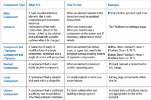
Component types in Figma
Practice of creating a component
- Think through the logic. Before clicking “Create Component,” the designer must answer three questions: where will this button be used, what states will it have, and will it have different sizes or types? If the structure isn’t thought through right away, you’ll have to redesign it later. Next, build the base version:
- frame with Auto Layout ;
- text inside;
- internal indents;
- background color;
- rounding.
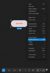
- Turn it into a main component. Once the element is ready, select the frame and choose Create Component. This is now the main component in Figma. It will have a purple border, indicating it’s the source. A good practice is to immediately rename the component to something descriptive (e.g., Button/Primary), check the layer structure, and ensure there are no unnecessary elements.
- Add variants. If a button has states (Default, Hover, Disabled) or sizes (S, M, L), separate versions are created and then combined using “Combine as variants.” Next, set the properties:
- State;
- Size;
- Type (if there are different types of buttons).
- Test on a real screen. A component isn’t considered complete until it’s tested in context. You need to:
- insert multiple instances into different screens;
- change text;
- try a long text;
- Check how Auto Layout behaves.
Common mistakes when working with components
Components make work easier, but only if they are used systematically. Here are the most common problems that gradually destroy order in a layout.
- Mass Detach. An instance “just doesn’t fit,” so the designer detaches it from the main component. This is quick in the moment, but after a couple of weeks, you might find that half the screens are no longer connected to the system. As a result, changes to the main component stop propagating, and the interface style begins to diverge. Rather than detach, it’s better to add a new variant, expand the properties, or rebuild the structure.
- Creating duplicates instead of developing the system. Instead of adding a Size = Large variant, a new “Button Big” component is created. Then another one, “Button Big 2.” This gradually leads to ten nearly identical components. Maintaining them is difficult. It’s better to add the new variant to an existing Component Set—then everything stays in one place and is managed via properties.
- Lack of logic in naming. Button1, Button_new, Final_Button_Real_Final—names like these quickly turn a library into chaos. Components should be named according to the structure: for example, Button / Primary / Default.
- Overly complex nesting. Components within components within components without a clear architecture. As a result, changes are unpredictable, and even the author finds the structure difficult to understand. It’s good when the structure is clear to another designer without explanation.
- Ignoring Auto Layout and responsiveness. A component without Auto Layout might look beautiful at one size, but break when the text changes. If an element is expected to change content, it must be responsive. Otherwise, every non-standard case will require manual editing.