What is a website footer, and how to make it user-friendly?
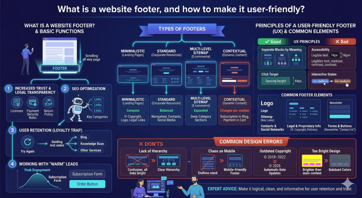
Table of Contents
Rarely does a user scroll all the way to the bottom of a website—only to discover a wealth of useful information in the footer. We explain why it’s important and how to create a design that helps users solve problems.
What is a website footer?
The footer (from the English word “footer”) is the final section of a web page. It’s typically continuous: the designer creates their design once and then repeats it on the remaining pages. The footer is the logical conclusion of a website, an important navigation tool, and a thoughtful hint. It typically includes links to the main sections, essential legal information, links to the company’s social media, and contact information.
If a user scrolls to the bottom of the page and doesn’t find an answer to their questions, the footer will offer options—for example, reviewing the return policy, visiting the blog, or going to social media to learn more about the brand.

Basic functions of the footer
The footer impacts key metrics: sales, page views, and search rankings. Let’s list the main options.
- Increased trust and legal transparency. For many industries, such as finance, medicine, and law, having licenses and full payment details in the footer is a must. This signals to users: “The company is genuine and transparent.” This directly impacts conversion: people are more likely to leave their card details on a website where return policies and security rules are clearly stated in the footer.
- SEO optimization helps search engines. Search engine robots use footer links to crawl a website. If a company has a large catalog, footer links to key categories help robots find and “read” important pages faster.
- User retention. For a website owner, every lost user is lost money. The footer acts as a “loyalty trap”: if a user has browsed the entire page without finding a solution, the company uses the footer to offer the opportunity to “try again”—to check out the blog, knowledge base, or other services. This increases the time spent on the site and the depth of browsing.
- Working with “warm” leads. People who scroll all the way to the footer are the most engaged audience. They’ve already explored your product. Placing a subscription form or order button in this area allows you to catch the user at the peak of their engagement. This is an effective tool for building an email list that will generate repeat sales in the future.

What elements are placed in the footer?
The content of the footer depends on the type of project, but there is a basic set of the most common elements.
- A logo is a duplication of a brand to strengthen recognition.
- A sitemap is a system of links to the main sections and product categories so that the user doesn’t have to scroll back to the header.
- Contacts and social networks – telephone, email, social networks, office address, sometimes directions.
- Legal and proprietary information — copyright (©), privacy policy, return policy, licenses, link to the offer, and personal data processing policy.
- Forms and buttons – a feedback form, a newsletter subscription field, or a “Contact us” button.
Types of footers
The type of footer depends on the amount of information on the website. Typically, there are four types:
- Minimalistic – a compact panel containing only essential attributes, such as copyright, logo, and legal links. It’s typically used on landing pages to avoid visual clutter and distract from the conversion process.
- Standard is a balanced structure of three to four columns. It allows for logical placement of navigation, contacts, and social media sections. This is a universal solution for most corporate resources.
- A navigation or multi-level sitemap is an expanded, multi-level sitemap. Essential for e-commerce and large portals for quick access to deep category sections without having to return to the header.
- Contextual — a footer whose composition changes depending on the section. It helps offer users relevant tools, such as a subscription form on a blog or payment methods in a shopping cart.
Principles of a User-Friendly Footer (UX)
- Separate blocks by meaning. Group links into categories with clear headings. This simplifies scanning the structure and speeds up finding the section you need.
- Accessibility. Maintain a minimum font size of 14 pixels and WCAG contrast standards. Footer text should be legible on dark or complex backgrounds.
- Click target. Provide sufficient line height and spacing between links. The minimum click target is 44 pixels high to prevent accidental clicks on mobile devices.
- Interactive states. Use clear visual feedback for links. Color changes or underlining confirm that an element is clickable.
Footer design errors
Check your layout for the following errors:
- Lack of hierarchy in links. When links to the privacy policy appear as bright as links to the product catalog, the user gets confused.
- Chaos in the mobile version. Five columns on the desktop become an endless page on the mobile version. A separate footer needs to be designed for mobile.
- Outdated copyright. Seeing “© 2018–2022” on a website in 2026 is a sure sign the project isn’t being worked on. Set up automatic date updates.
- The design is too bright. The footer is the final step; it shouldn’t be brighter than the main content. Use more subdued colors.