BUZZBONGO TECH GEEKS

YOUR TECH GUIDES
What is Tableau and why do analysts need it?
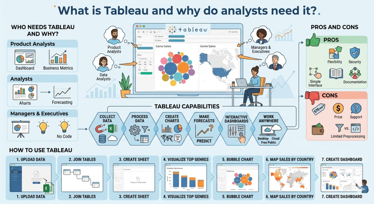
Why do analysts need BI tools when code is available? We’ll explore the pros and cons of one popular system and show you what it can do.

Data visualization helps communicate results to colleagues, managers, or technically untrained audiences. Therefore, analysts often create graphs and prepare presentations. This doesn’t always require additional software—visualization tools are available in many programming languages, such as Python.

This method isn’t suitable when an analyst or developer needs to visualize the results for people who don’t understand code. In such cases, BI (business intelligence) systems are used. They help analyze data and create graphs with virtually no programming.

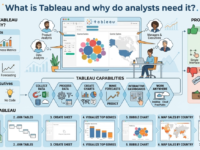
One of the most popular BI systems is Tableau. It regularly receives high user ratings and is used by many international companies. This tool is often tested during interviews, so analysts and managers need to understand its key features and parameters.

Who needs Tableau and why?

Tableau is needed:

– Product analysts to create dashboards with business metrics for colleagues, from product and marketing teams to engineers and senior managers.
– Analysts to create charts and present research results. Tableau is also used for data analysis, simple calculations, and forecasting.
– Managers and executives to prepare charts and presentations without code in a user-friendly interface.

Tableau capabilities

Tableau offers a wide range of visualization and analytics tools. For example, you can find anomalies and patterns in your data or calculate business metrics over time.

What the service can do:

Collect and combine data from different sources —whether from an Excel spreadsheet or a database. Tableau can combine data from multiple tables into one in several ways.

Process and transform data. The service helps you group and filter data, add calculations, and build pivot tables for reports. This processing helps prepare data for visualization, so your Tableau charts will be more effective.
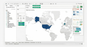
Create charts —from simple pie and bar graphs to detailed maps. You can also add help elements and tooltips to your visualizations.

Make forecasts. Tableau helps you solve simple machine learning tasks: identify trends, make predictions, and segment data.
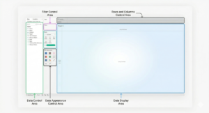
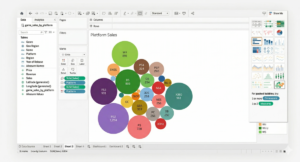
Create interactive dashboards and presentations. Dashboards let you present research and share relevant data with colleagues. Visualizations and dashboards can be interactive, allowing users to control the information displayed. For example, users can select a specific time period to display only data for May of this year in the charts. Work with projects on a local computer or in the cloud. Tableau Desktop for Windows and Mac and Tableau Cloud are paid programs. There’s also a free version, Tableau Public, but it has a number of limitations. For example, it doesn’t allow you to work with databases or save results to your computer. However, it can still create high-quality visualizations and even build a portfolio. These can be published on the Tableau Public server.

Pros and Cons of Tableau

Tableau skills are often sought after for analysts, data engineers, and developers. While it’s a convenient tool for businesses, it does have a few drawbacks.

Pros

Flexibility and versatility. Tableau’s tools can combine estimates in Excel and product data from cloud storage. And operations that would otherwise require extensive coding can be performed with just a few clicks. The system is highly customizable, so visualizations and dashboards can be tailored and made more complex to suit the user’s needs.

Ease of access and security. The paid version of Tableau includes Tableau Server, which allows you to share dashboards and visualizations with colleagues. Users can be assigned various permissions, restricting access to viewing and editing sensitive data.

A simple and user-friendly interface. You can create a simple chart like a bar chart, with little or no training: most Tableau functions are intuitive. Tableau performs some calculations automatically and can suggest the appropriate chart type.

Detailed documentation and an active user community. For complex visualizations, you can use the settings descriptions in Tableau Help. The instructions are easy to follow thanks to screenshots. If they don’t answer your question, you can ask other users for help. Tableau has a large community of enthusiastic specialists.

 Cons

Price: An individual license costs about $70 per month.

Support. Users complain that support staff may recommend purchasing additional features instead of solving the problem.

Limited data preprocessing functions. Complex operations are best performed in other tools. For example, lemmatization (converting words to their dictionary form) is beyond Tableau’s capabilities. Data can be processed using code and specialized libraries and then loaded into Tableau.


How to use Tableau

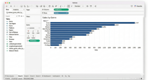
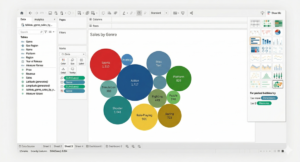
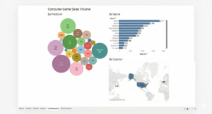
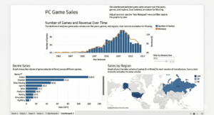
For example, an analyst at a computer game development company studies game sales data and wants to compile a report for colleagues. They collect information on which regions are most popular for game purchases, as well as which genres and developers are in demand. They visualize the research results in Tableau and compile the resulting graphs into a dashboard.

To get started, you need to install Tableau. You can download Tableau Desktop from the official website. The program offers a 14-day trial period from the moment of installation. Alternatively, you can use the free Tableau Public version. It includes all the tool’s core features.

Once Tableau is installed, you can get started:

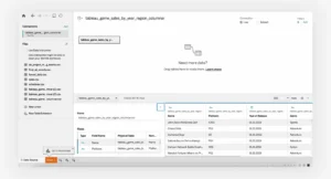
1. On the start page, the analyst uploads data. This could be an Excel spreadsheet, a database, a text file, or a PDF.

2. Once the file is loaded, Tableau will immediately display its contents.

Width 1280 Q80 (12)

The data management screen allows you to join tables before visualization.
3. To start working with data and building charts in Tableau, open a new sheet by clicking the plus icon in the bottom left. Tableau will open the sheet editing screen.
Gemini Generated Image Uvyh5guvyh5guvyh
The data is displayed on the left. You can drag the desired column to another area using the cursor.
4. To visualize the top-selling genres, the analyst selects a column chart. The rows will represent game genres, and the columns will represent the millions of copies sold. Data can be dragged and dropped into the desired area. Tableau will suggest a suitable chart type—all that’s left to do is sort it and add labels.
Gemini Generated Image Xe1id6xe1id6xe1i
To add labels to the chart, drag the desired data into the Marks → Label section.
5. The same information can be presented differently – in a bubble chart. The chart type is selected in the Show Me menu on the left.
Gemini Generated Image Qrqhfuqrqhfuqrqh
The Show Me menu highlights available charts based on the data selected.
The analyst changes the data displayed: now a bubble chart shows which platforms’ games are selling the best.
Gemini Generated Image 2f7kxw2f7kxw2f7k
You can change the data for visualization in the row and column management area.
6. The next graph should show sales data by country. This information is best displayed on a map. Tableau will automatically find the geographic data, but if it can’t, you can do it manually. The service will offer to create a map and automatically highlight the contours of the countries included in the data. The country color on the graph depends on the volume of game sales—the higher the volume, the more saturated the color.
Gemini Generated Image 5s6ne45s6ne45s6n
Sometimes you need to tell Tableau that a column stores geographic data. Otherwise, map visualizations won’t be available in the right-hand menu.
7. From the resulting charts in Tableau, you can now create a small dashboard.
Gemini Generated Image Xzhpqoxzhpqoxzhp
To create a dashboard, select the New Dashboard option at the bottom. You can drag and drop the desired charts onto your dashboard.
The report is ready—the colleagues are happy. The analyst didn’t need complex tools or charts for this dashboard. But a big meeting with investors is coming up, and the analyst needs to make the dashboard more interactive and visual. A couple of hours of work, and the report is ready to be shown to investors.
Gemini Generated Image Thf1z2thf1z2thf1
The dashboard has become interactive—game release years can now be controlled. And the graph captions add additional information.

Expert advice

Moses Gaspar:
Tableau is a tool with a huge number of features. It’s impossible to describe all its capabilities and nuances, so it’s crucial to learn by example. The Tableau Public website offers a rich online gallery of ready-made visualizations. Each visualization can be copied to the cloud and analyzed. For example, you can analyze how the author solved a computational problem or constructed a graph. Studying the inner workings of dashboards you like helps professionals refine their own visualizations.